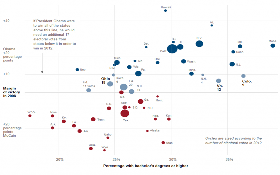
The NYTimes has just released a chart placing all electoral votes from 2008 within their respective Dem or Rep positions. The chart also displays these perspectives with regard to % of Bachelor’s Degrees per state. Interestingly, the states with the most bachelor’s degrees, tends to vote Democrat while those with less voted for McCain in 2008. We highly recommend checking this out as it is a good demonstration of effective use of spatial data and how they reveal discernible trends.

You can read the full article here: http://www.nytimes.com/interactive/2011/09/30/us/politics/keys-to-victory.html?ref=politics
Recent Comments